Case study
Dating Retreat in the Galilee
A brand and website for a boutique dating retreat in the Galilee, made to feel like the retreat itself: warm, unhurried and real.
01The context: Two days in the Galilee, for people ready to meet for real.
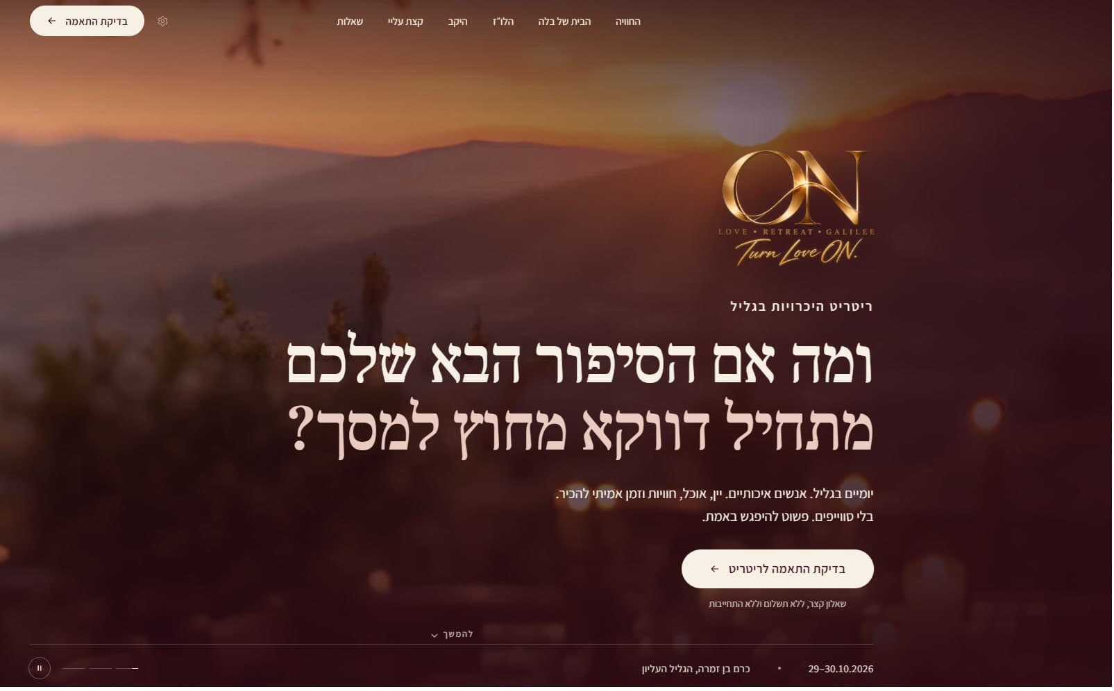
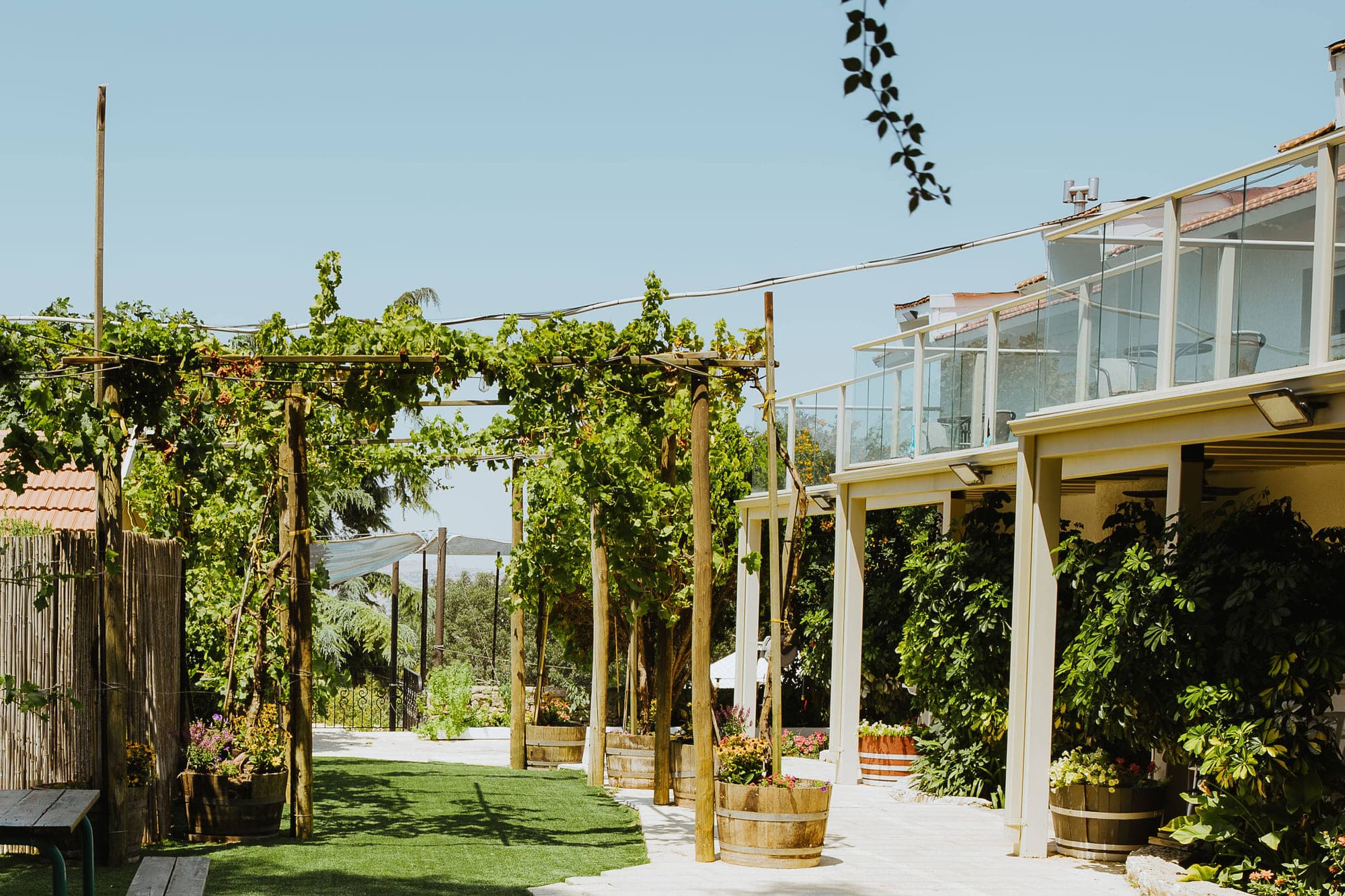
ON is a boutique dating retreat in the Upper Galilee, with wine, food and real time to get to know each other.
The website is where people meet ON first. It had to feel warm, and be trustworthy enough that people would want to come.
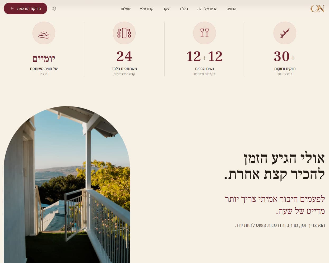
The format, as the site presents it
- Two days
- of shared experience in the Galilee
- 24
- participants only, an intimate group
- 12 + 12
- women and men, a balanced group
- 30+
- single women and men, aged 30 and up
02The problem: It could easily look like something it is not.
- A dating app.
- A generic event page.
- A wedding website.
- A wellness landing page.
ON is none of them. Its first screen says it plainly:
No swipes. Just meeting for real.
בלי סוויפים. פשוט להיפגש באמת.
03Direction: A few materials, all of them warm.
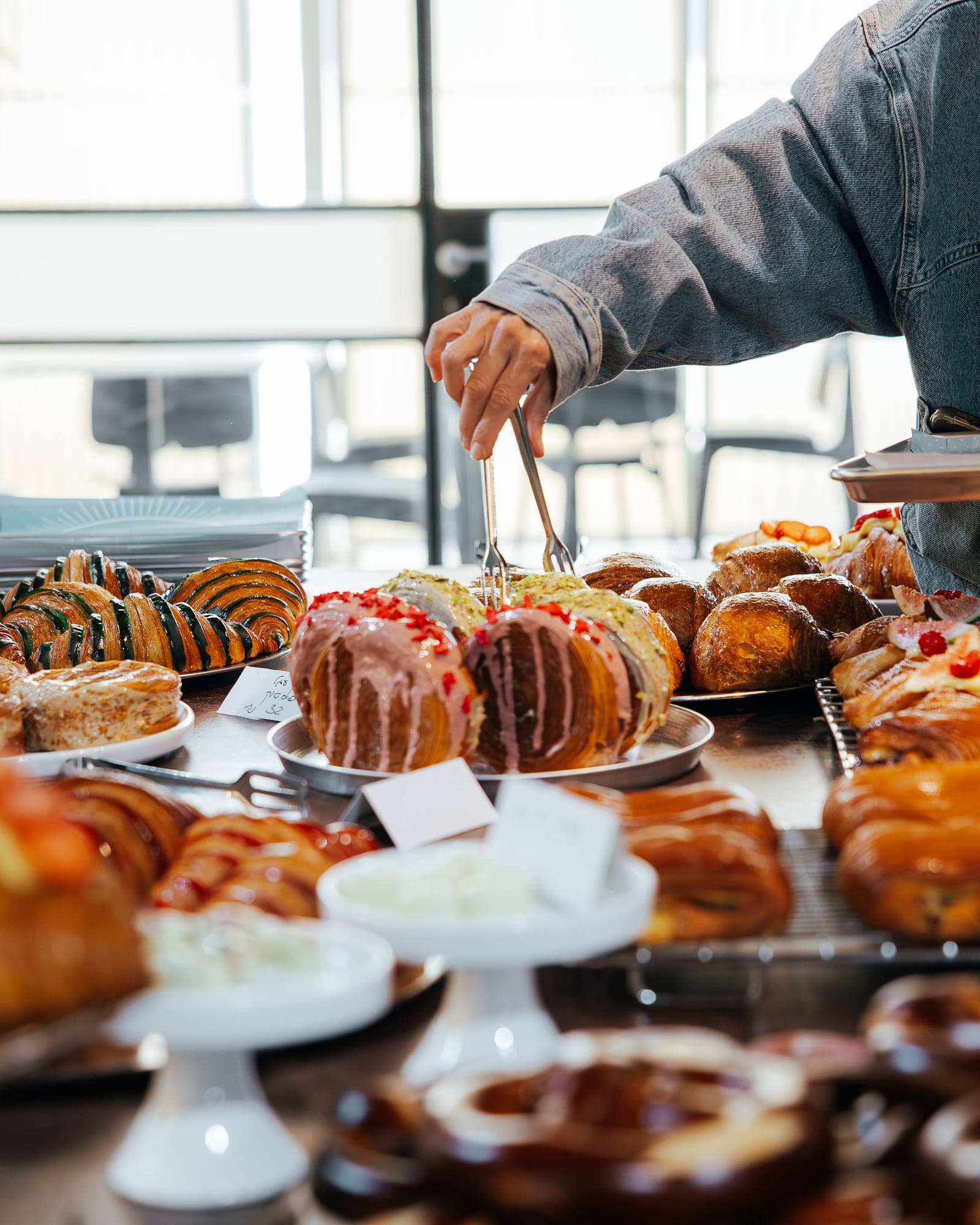
Gold, the colors of wine and evening light, a serif typeface for the questions that matter, and real places.

- Cream#F6F0E5
- Blush#F1E1D5
- Bordeaux#6D1F2D
- Wine#501320
- Gold#C39A5B
- Ink#231A16
04From brand to product: The identity became the product.
Structure
Six destinations, and one clear action.
- 1The experience
- 2Bella’s house
- 3The schedule
- 4The winery
- 5About me
- 6Questions
- Check your fit
A suitability check, not a booking
A short questionnaire, no payment and no commitment. The same button also sits in the site’s header.
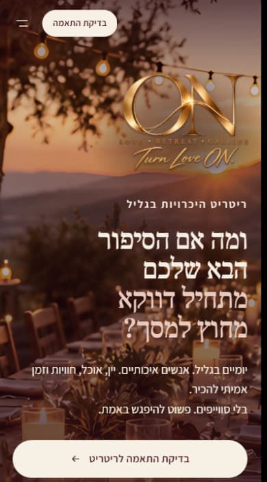
On a phone
The opening is rebuilt for the phone, not just made smaller: the mark leads, the question sets over four lines, and the action spans the bottom of the screen.
Film
The mark, the promise, the Galilee, the website.
05Live: From identity to launch.
The ON identity and its website, now live.
Visit live site ON (opens in a new tab)Next project
המחלבה
Operational product
An operational workforce product for scheduling, management workflows and day-to-day operations.